Southern Resonant Logo
I'm a paragraph. To update me, go to the Data Manager. The Data Manager is where you store and collect data for your site.
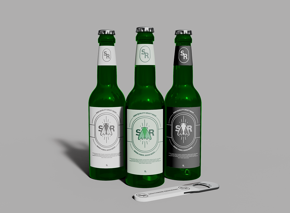
BRAND REDESIGN - SOUTHERN RESONANT
This was a branding project for Southern Resonant Beer Company in East Texas.
After changing the name of the company Southern Resonant wanted to explore different design styles. We presented the client with a logo that was illustrated mascot logo with minimal word mark.
The client was immediately drawn to the design's bold typography, simple iconography, and versatility for the brand.
BRAND THUMB-NAILING
During the thumb-nailing stage we tried to really hit on the brand attributes of layback, chill, bringing the outside to the inside. we gave it a cool layback design that's more on the professional side to be able to compete with other companies.
LOGO VARIATION
After meeting with the client and presenting them with the logo both the client and I felt like we could push the logo seen above further. Simplifying the logo and reimagining some elements create a similar silhouette and have evident trace of DNA from the last iteration.


